Creating Portfolio : a review
1. Ergonomic Audit of Jon Yablonski's Website
Before designing my own portfolio, I first conducted a benchmark of various designers' websites to draw inspiration from best practices and avoid common pitfalls. Among these sites, Jon Yablonski's stood out particularly. Jon Yablonski is a renowned Senior UX Designer, known especially for his book "Laws of UX," published by O'Reilly. This book, which details the psychological principles applied to design, is a reference for UX designers. Naturally, I turned to his portfolio for an in-depth case study.
1.1. Why I Chose Jon Yablonski's Website
Jon Yablonski's website goes far beyond a simple portfolio; it embodies a true showcase of his expertise and thoughts on user experience. It's not just a space to display projects, but a strategic tool that reflects how a high-level UX designer conceptualizes the interaction between a user and a digital interface. The choice of this site for my audit is based on several factors:
- User-Centered Approach: Jon's website is a perfect example of user-centered design, where every design decision seems to have been made with the end-user in mind. The integration of "Laws of UX" principles into his portfolio shows consistency between his theories and their practical application.
- Diverse Audience: The site is designed to cater to a diverse audience, including recruiters, experienced designers, and students. This necessitates a high level of accessibility and clarity, which is crucial for a portfolio aimed at such a wide audience.
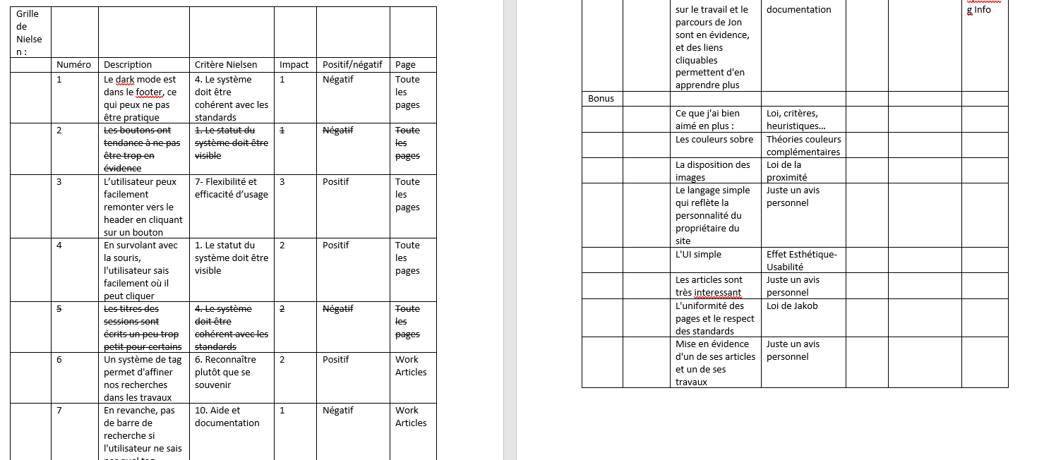
To conduct my audit, I used Nielsen's usability heuristics, a set of design principles that help evaluate the effectiveness of an interface. These heuristics were particularly relevant for examining how Jon's site meets the needs of a broad audience while maintaining an impeccable user experience.
1.2. Strengths of Jon Yablonski's Website
My audit revealed several positive aspects of Jon's website:
- System Status Visibility: Jon has implemented an essential feature where every interactive element, such as a button, changes appearance when hovered over by the mouse. This allows the user to immediately understand which actions are available, thus adhering to Nielsen's heuristic on system status visibility.
- Navigation and Flexibility: The site has a button that allows users to easily scroll back to the top of the page, enhancing flexibility and usability. The site structure is clear and intuitive, with navigation that facilitates access to different sections like "Work," "Writing," and "Speaking."
- Use of Tags: The "Articles" and "Work" sections are well-organized with tags, making it easier to search for specific information. This demonstrates a particular attention to user experience by simplifying navigation through potentially vast and varied content.

1.3. Areas for Improvement
Despite its many strengths, Jon's site has a few areas that could be improved:
- Accessibility of Dark Mode: While dark mode is a feature appreciated by many users, its placement in the footer makes it less accessible. This requires users to scroll down to activate it, which could detract from the user experience.
- Title Sizes: Some section titles are slightly too small, which can pose readability issues, especially for users with reduced vision. Slightly increasing the title sizes would improve reading comfort.
1.4. What I Learned from This Audit
This audit allowed me to better understand the importance of rigorously applying UX design standards, such as those defined by Nielsen's heuristics. I also observed that minimalist aesthetics, when used effectively, can significantly enhance usability while remaining aligned with well-established UX laws, such as Jakob's Law (which suggests that users prefer interfaces that behave similarly to those they are already familiar with) or the Law of Proximity (which concerns how elements close to each other are perceived as related).
1.5. Conclusion
Here, I present just one example of an audit, that of Jon Yablonski's site, to illustrate the lessons learned from these analyses. These various audits have been a true source of inspiration for me and have guided my thinking in designing my own portfolio. Thanks to them, I identified areas for improvement and began formulating my design ideas for a portfolio that is both functional, aesthetically pleasing, and user-centered.
2. Wireframing: From Concept to Validation
The wireframing phase was a crucial step in the development of my portfolio, allowing me to materialize the ideas from the ergonomic audits I conducted, particularly on Jon Yablonski's site. This phase offered me the opportunity to test and validate my concepts before moving on to the final design, ensuring that every design element was in line with user needs.
2.1. Initial Sketches and Paper Wireframing
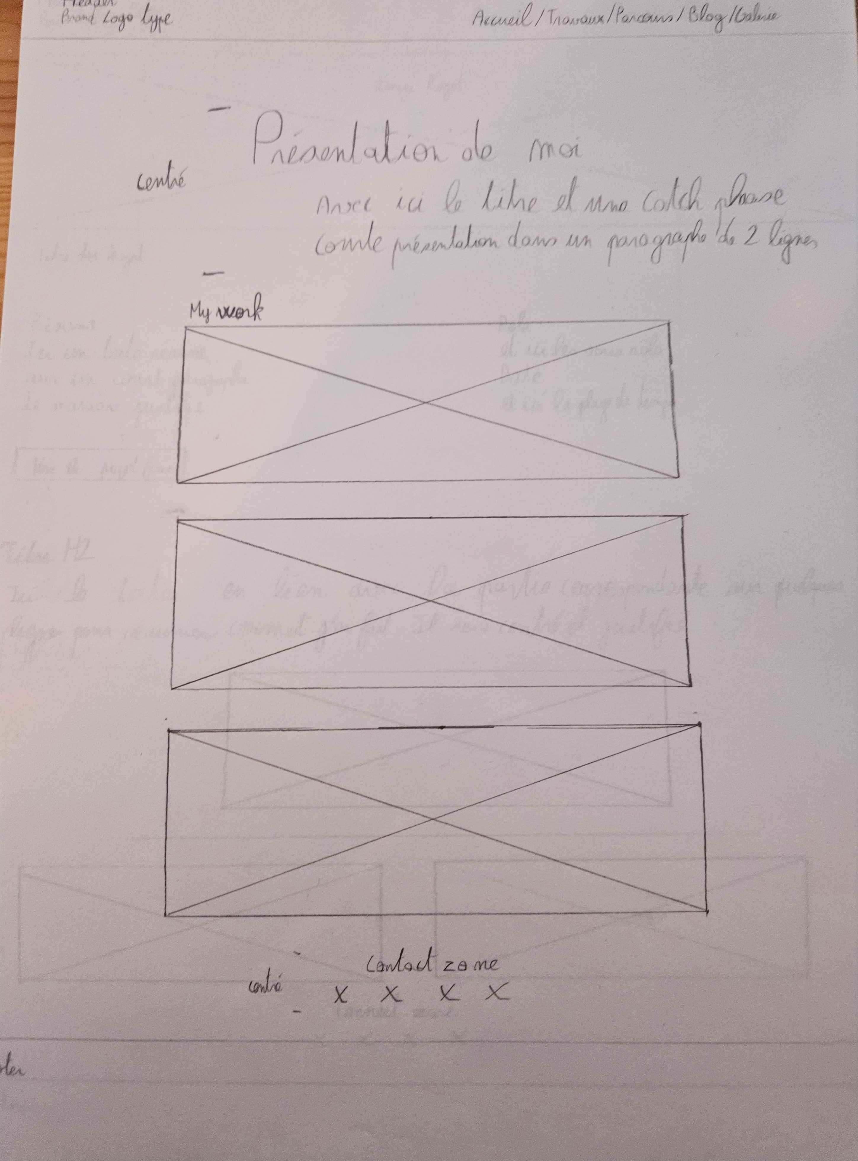
Before diving into digital design, I chose to start with zoning and paper wireframing. This traditional method allowed me to quickly experiment with different layout and element organization ideas. By using just a pencil and paper, I could sketch designs without being limited by digital tools, giving me the freedom to explore multiple approaches. This process is essential because it allows for iterative thinking, where elements can be easily adjusted and reorganized without technical constraints.
Manual wireframing also helped me visualize the information architecture and determine strategic locations for key elements such as the navigation menu, content sections, and calls to action. Based on the best practices observed during my audits, I was able to create an intuitive structure that maximizes user navigation ease.

2.2. Consultation with Colleagues and Non-Experts
To refine my design choices, I sought feedback from several colleagues, both experts and non-experts in UX design. This consultation allowed me to gather varied perspectives on clarity, aesthetics, and overall user experience. Feedback from non-experts was particularly valuable as they represent the viewpoint of the average user, often unfamiliar with the subtleties of UX design. This feedback highlighted potentially problematic aspects that I hadn't initially considered.
For example, some colleagues suggested improving the visual hierarchy to better guide users in their navigation. Others recommended simplifying certain elements to avoid overloading the interface. This feedback pushed me to reconsider some aspects of my design and make adjustments to ensure better understanding and optimized accessibility.
2.3. Creating Mockups and User Testing
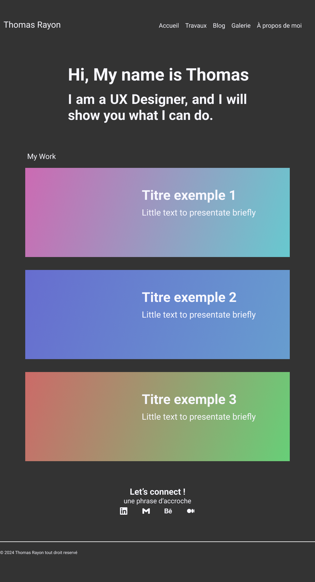
After validating the paper wireframes, I moved on to creating digital mockups. These mockups were designed following the design principles I had identified as crucial during my audits, such as system status visibility, usability flexibility, and minimalist aesthetics. The goal was to create a coherent interface that not only catches the eye but also intuitively guides the user through the site content.
Once the mockups were ready, I conducted user tests to verify their effectiveness. These tests were conducted with target groups including UX designers, who assessed the design finesse, and human resources students, who are often the first to review portfolios during recruitment processes. This approach allowed me to gather diverse feedback, which was crucial for further refining the mockups.
2.4. Mockup Validation
The results of the user tests confirmed that the mockups met usability and efficiency criteria. Users appreciated the clarity of the navigation and the simplicity of the interface, which allows for a smooth exploration of the content. Recruiters particularly highlighted the ease of access to key information, while designers praised the visual harmony and adherence to UX standards.
Positive feedback on these aspects was crucial for validating the mockups and giving me the confidence to move on to the next phase of development. I was able to ensure that every design decision, whether it was the layout of elements or the color palette, contributed to an optimized user experience.

2.5. Conclusion
The wireframing phase was essential for structuring and refining my portfolio. By combining best practices observed during my audits with concrete user feedback, I was able to create a solid foundation on which I built the final version of my site. This phase also allowed me to incorporate elements of flexibility into the design, ensuring that my portfolio can evolve based on future feedback and emerging trends in UX design.
Thanks to this methodical approach, I was able to develop a portfolio that not only reflects my UX design skills but is also user-centered, functional, and aesthetically pleasing.
3. Implementation: From Design to Code
Transforming the validated mockups into a functional website was a pivotal step in creating my portfolio. This phase not only allowed me to put my UX design knowledge into practice but also to acquire new skills in web development by learning HTML, CSS, and JavaScript. The challenge of translating visual concepts into an interactive and high-performing site enriched my expertise and gave me full control over the creation process.
3.1. Learning Web Development
Although my primary expertise lies in UX design, I decided to learn HTML, CSS, and JavaScript to create my site myself. This decision was motivated by several factors:
- Mastery of the Creation Process: By learning to code, I could control every aspect of the project, from the initial concept to the final implementation. This allowed me to ensure that every element of the site matched my vision without compromise.
- HTML: I learned how to structure my pages semantically, using appropriate tags to improve accessibility and optimize content readability. This approach ensures that the content is understandable not only to users but also to search engines, which is crucial for search engine optimization (SEO).
- CSS: For the design, I used CSS to style my site according to the validated mockups. This included applying consistent colors, managing typography, and creating responsive layouts that adapt perfectly to all screen types. I also integrated subtle animations and transitions, such as button color changes on hover, to enhance interactivity without burdening the user experience.
- JavaScript: Finally, I used JavaScript to add interactive features to my site, such as dropdown menus, text animations, and dynamic effects that add a modern touch and improve the user experience. These features also help make the site more engaging and interactive.
3.2. Justification of Design Choices
The design choices I made were guided by the UX design principles I had studied and applied throughout the project. These choices aimed to create an interface that was both functional and aesthetic, while respecting the needs of the end-users:
- Visual Consistency: Inspired by my audit of Jon Yablonski's site, I aimed to create a site where every visual element is harmonious and consistent, from color choices to typography. Rigorous visual consistency contributes to a smooth and uniform user experience, which is essential for maintaining user engagement and avoiding confusion.
- Accessibility: The semantic HTML structure and color contrasts were carefully selected to ensure that the site is accessible to all users, including those with visual impairments. I ensured that every element was sufficiently contrasted to be readable, even for visually impaired users, and that navigation was intuitive.
- Performance: I optimized images and minimized CSS and JavaScript files to improve loading times. Performance is crucial not only for user experience but also for SEO, as a fast-loading site is better ranked by search engines. I used techniques such as image compression, CSS/JS file minification, and lazy loading to ensure optimal performance.
3.3. Research on SEO
Aware of the importance of SEO in increasing the visibility of my portfolio, I conducted thorough research to ensure the site adhered to best SEO practices. This research covered several key aspects:
- HTML Tag Optimization: I designed each page with title tags, meta descriptions, and ALT tags for images, all optimized to include relevant keywords. This optimization allows search engines to better understand the site's content and improve its ranking in search results.
- Site Performance: I learned that loading speed has a direct impact on SEO. For this, I used tools like Google PageSpeed Insights to test and improve the site's performance, identifying and correcting slow points.
- Site Architecture: I structured the site so that search engines could easily index the content by using clear navigation and user-friendly URLs. This ensures that every page of the site is accessible to indexing bots, which is essential for good SEO.
- Quality Content: In addition to the technical aspects, I ensured that the content on each page was relevant, well-structured, and optimized for UX design-related keywords. This attention to content improves the site's relevance to search engines and helps attract a qualified audience.
3.4. Validation and Testing
Once the site was coded, I undertook a series of tests to ensure that each feature was correctly implemented and that the design adhered to the validated mockups. These tests were essential to ensure the site offered an optimal user experience:
- Responsiveness Tests: I verified that the site was fully responsive, meaning it offered an optimal user experience on all devices, from desktops to smartphones. This responsiveness is crucial to ensuring that the site is accessible and enjoyable to use, regardless of the device used by the user.
- Accessibility Tests: I used tools like WAVE to ensure the site adhered to current accessibility standards. These tests allowed me to identify and correct potential accessibility issues, ensuring that the site was usable by the widest possible audience.
- Performance Tests: As mentioned earlier, the site's performance was tested and optimized to ensure fast page loading, contributing to a better user experience and better SEO. These tests ensured that the optimizations made were effective and that the site operated smoothly.
3.5. Conclusion
Implementing the website from the mockups was an educational step that consolidated my UX design skills while allowing me to develop expertise in web development. Thanks to this learning process, I was able to ensure that every aspect of the site, from design to performance, was optimized to offer a smooth and satisfying user experience while adhering to SEO best practices. The result is a portfolio that not only reflects my skills and passion for UX design but is also technically solid and well-positioned to be discovered by potential recruiters.