Seamless User Experience: Designing an Intuitive Partner Registration Interface for CMA CGM
1. Introduction
This case study focuses on designing a partner account registration page for CMA CGM. The goal was to create an intuitive and user-friendly form, while adhering to the design system standards of CMA CGM. Below is a detailed analysis integrating visual, functional, and technical aspects of the design, aiming to optimize the user experience (UX).
2. Structure and Process
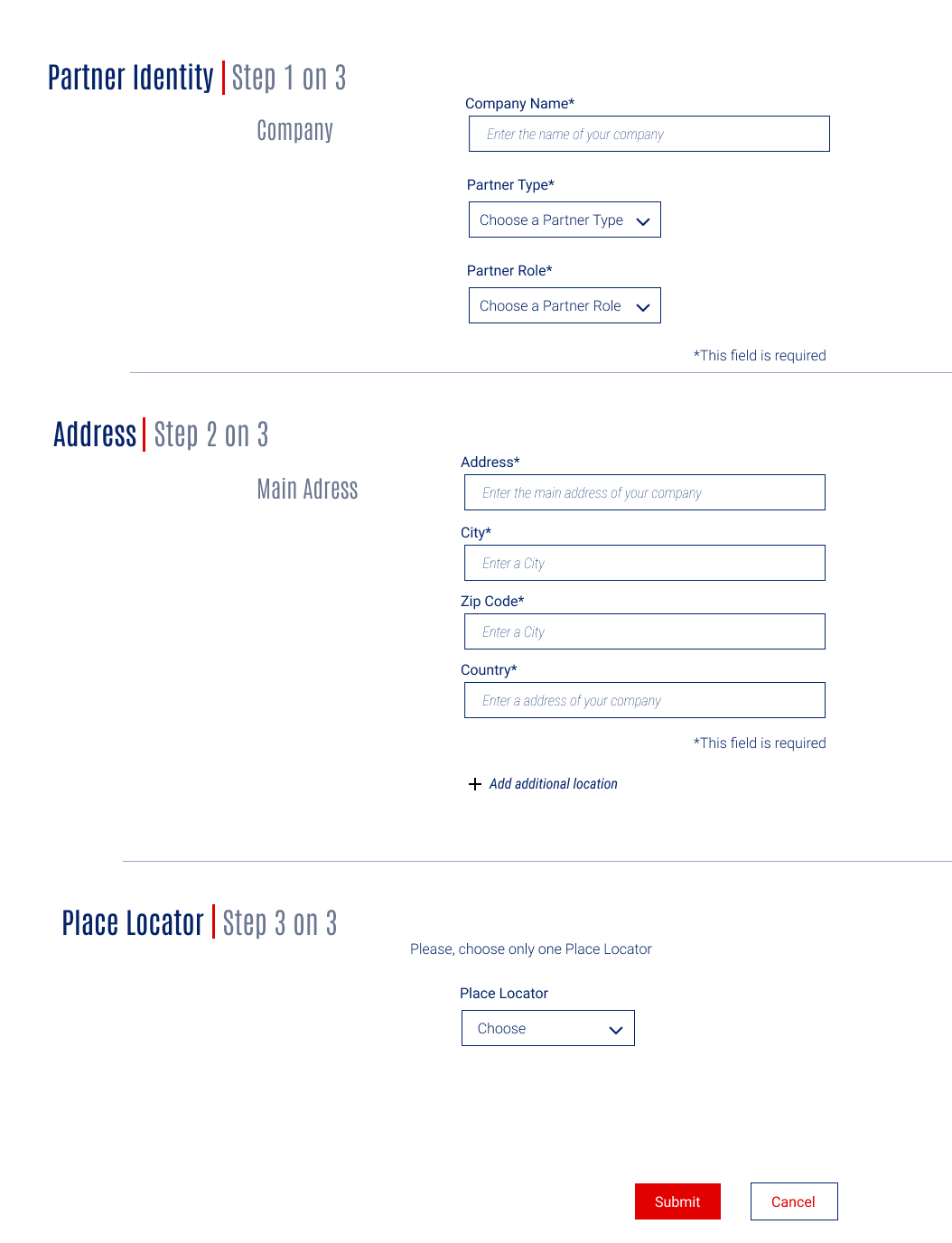
The registration process is divided into three main steps: Partner Identity, Address, and Place Locator. This progressive structure allows for smoother navigation, breaking a complex task into digestible segments. The interface is designed to guide the user progressively through each step, which is crucial for professional users requiring a seamless interaction.
3. Colors and Fonts
3.1. Color Palette
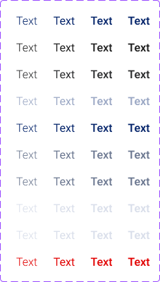
The color palette adheres to the CMA CGM design system, ensuring a clean, professional appearance that maintains high contrast for readability. Below is the color palette used, along with explanations and visual gradients for each.
- #04246A (Dark Blue): Used for titles, section headers, and links. This dark blue conveys trust and reliability, key values for a global logistics company.
- #FFFFFF (White): White is used for background and text on buttons or against darker colors, ensuring optimal contrast and readability.
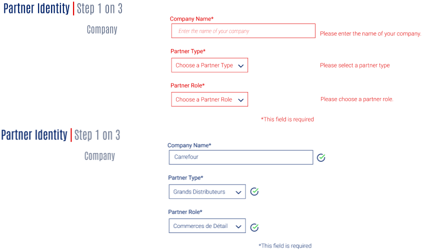
- #28CB38 (Bright Green): Reserved for validation success indicators, such as green checkmarks next to correctly filled fields, which signal success and completion.
- #6B7790 (Gray-Blue): This neutral color is used for secondary text and less important information, structuring the interface without distracting the user.
- #E20101 (Bright Red): Used for error messages and the Submit button. Red draws attention, making it ideal for urgent actions or alerts.
- #9AA7C4 (Light Gray): Utilized for form field borders and secondary elements, it helps separate sections without overwhelming the user.
3.2. Typography
Two fonts were selected to provide visual hierarchy and readability:
3.2.1 Antonio (Primary Font)
Antonio is used for headings and section titles. Its bold, modern design helps create a strong hierarchy and draws the user's attention to key sections.
Font size usage:
- h1: 32px, for the main page title.
- h2: 26px, for section headers.
- h3: 20px, for subsection titles.
- h4: 16px, for minor headings or subtitles.

3.2.2 Roboto (Secondary Font)
Roboto is used for body text, form labels, and secondary elements. Its clean and legible style ensures clarity, even in smaller sizes.
Font size usage:
- 16px Regular: For standard body text and form labels.
- 16px Italic: Used for placeholder text within input fields.
- 16px Light: For less prominent text elements or secondary information.

4. UI Organization and Usability
Titles and Sections: Each section (e.g., "Partner Identity", "Address", "Place Locator") is clearly distinguished using Antonio for headings and a dark blue (#04246A) to maintain hierarchy and guide the user through the form.
Form Fields: The form fields use Roboto for labels and input text. The fields are well-spaced and the use of a gray-blue (#6B7790) for labels ensures they remain visible without overwhelming the user.
Action Buttons: The Submit button uses bright red (#E20101) for high visibility, while the Cancel button is more understated with a light gray border (#9AA7C4), marking it as a secondary action.

5. Validation and Error Handling
Feedback is provided to users with clear visual cues:
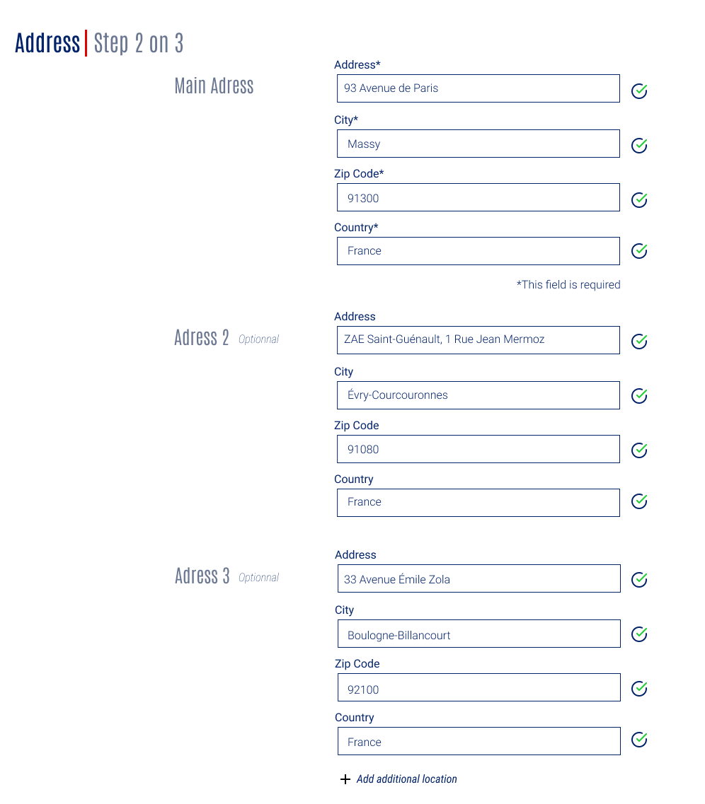
Successful Validation: Green checkmarks (#28CB38) appear next to correctly filled fields, giving users real-time confirmation.
Error Messages: Bright red (#E20101) is used for error messages, which are displayed next to the problematic fields, allowing users to quickly identify and resolve issues.

6. Dynamic Features
6.1. Dynamic Address Addition
The address section allows users to add up to three different addresses. This progressive disclosure feature helps keep the interface uncluttered while offering flexibility for companies with multiple locations. Users can reveal additional fields only when needed.

6.2. Location Selector
The final step includes a location selector, allowing users to choose specific locations such as PMF - TSF2XL (Port of Marseille Fos - Terminal Seayard Fos 2XL). Once selected, additional details like postal code, country code, and city ID are filled in automatically, speeding up the process.

7. Conclusion
This interface combines modern aesthetics with user-friendly functionality. The design adheres to the CMA CGM design system, ensuring brand consistency, while the use of real-time feedback and dynamic features creates an intuitive registration process. These choices enhance user experience by providing a clean, easy-to-navigate form for professionals.